Graphics
This page demonstrates some of the different graphics possible to generate with zEpid. These plots are all generated using matplotlib. The functions themselves return matplotlib.axes objects, so users can further edit and customize their plots. Let’s look at some of the plots
Functional Form Assessment
zEpid makes graphical (qualitative) and statistical (quantitative) functional form assessment easy to implement. Functional form assessments are available for either discrete or continuous variables. The distinction only matters for the calculation of the LOESS curve generated in the plots.
Plots and regression model results come from generalized linear models fit with statsmodels.
Let’s look at some examples. We will look at baseline age (discrete variable). We will compare linear, quadratic, and splines for the functional form. First, we set up the data
import zepid as ze
from zepid.graphics import functional_form_plot

df = ze.load_sample_data(timevary=False)
df['age0_sq'] = df['age0']**2
df[['rqs0', 'rqs1']] = ze.spline(df, var='age0', term=2, n_knots=3, knots=[30, 40, 55], restricted=True)
Linear
Now that our variables are all prepared, we will look at a basic linear term for age0.
functional_form_plot(df, outcome='dead', var='age0', discrete=True)
plt.show()
In the console, the following results will be printed
Warning: missing observations of model variables are dropped
0  observations were dropped from the functional form assessment
                 Generalized Linear Model Regression Results
==============================================================================
Dep. Variable:                   dead   No. Observations:                  547
Model:                            GLM   Df Residuals:                      545
Model Family:                Binomial   Df Model:                            1
Link Function:                  logit   Scale:                          1.0000
Method:                          IRLS   Log-Likelihood:                -239.25
Date:                Tue, 26 Jun 2018   Deviance:                       478.51
Time:                        08:25:47   Pearson chi2:                     553.
No. Iterations:                     5   Covariance Type:             nonrobust
==============================================================================
                 coef    std err          z      P>|z|      [0.025      0.975]
------------------------------------------------------------------------------
Intercept     -3.6271      0.537     -6.760      0.000      -4.679      -2.575
age0           0.0507      0.013      4.012      0.000       0.026       0.075
==============================================================================
AIC:  482.50783872152573
BIC:  -2957.4167585984537
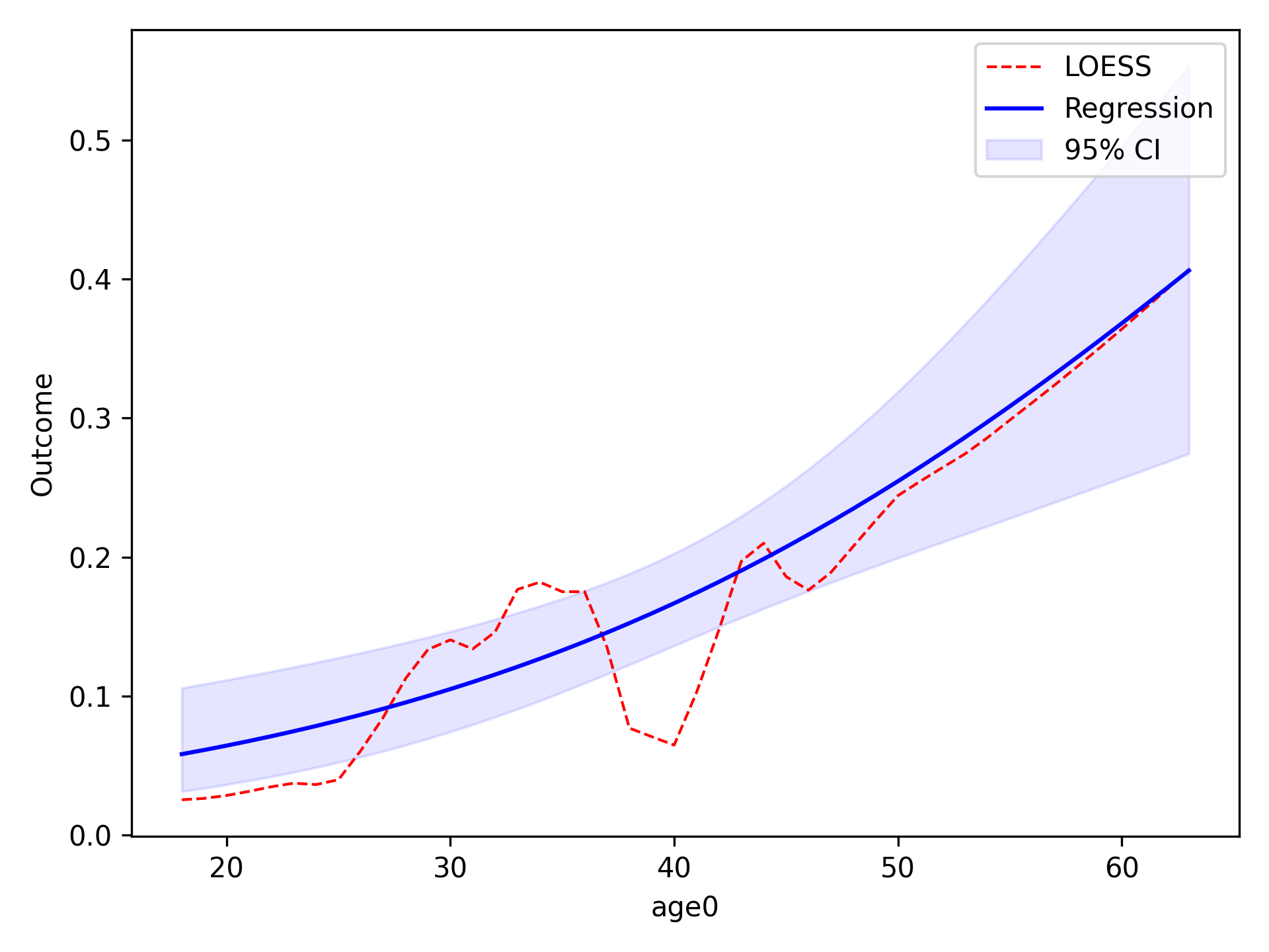
In the image, the blue line corresponds to the regression line and the shaded blue region is the 95% confidence
intervals. The red-dashed line is the statsmodels generated LOESS curve. We can also have the data points that the
LOESS curve is fit to plot as well
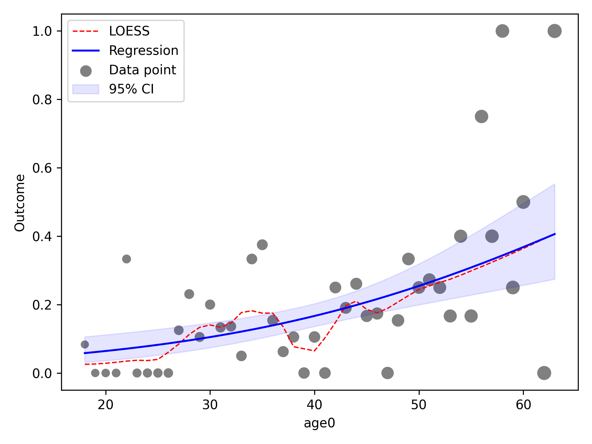
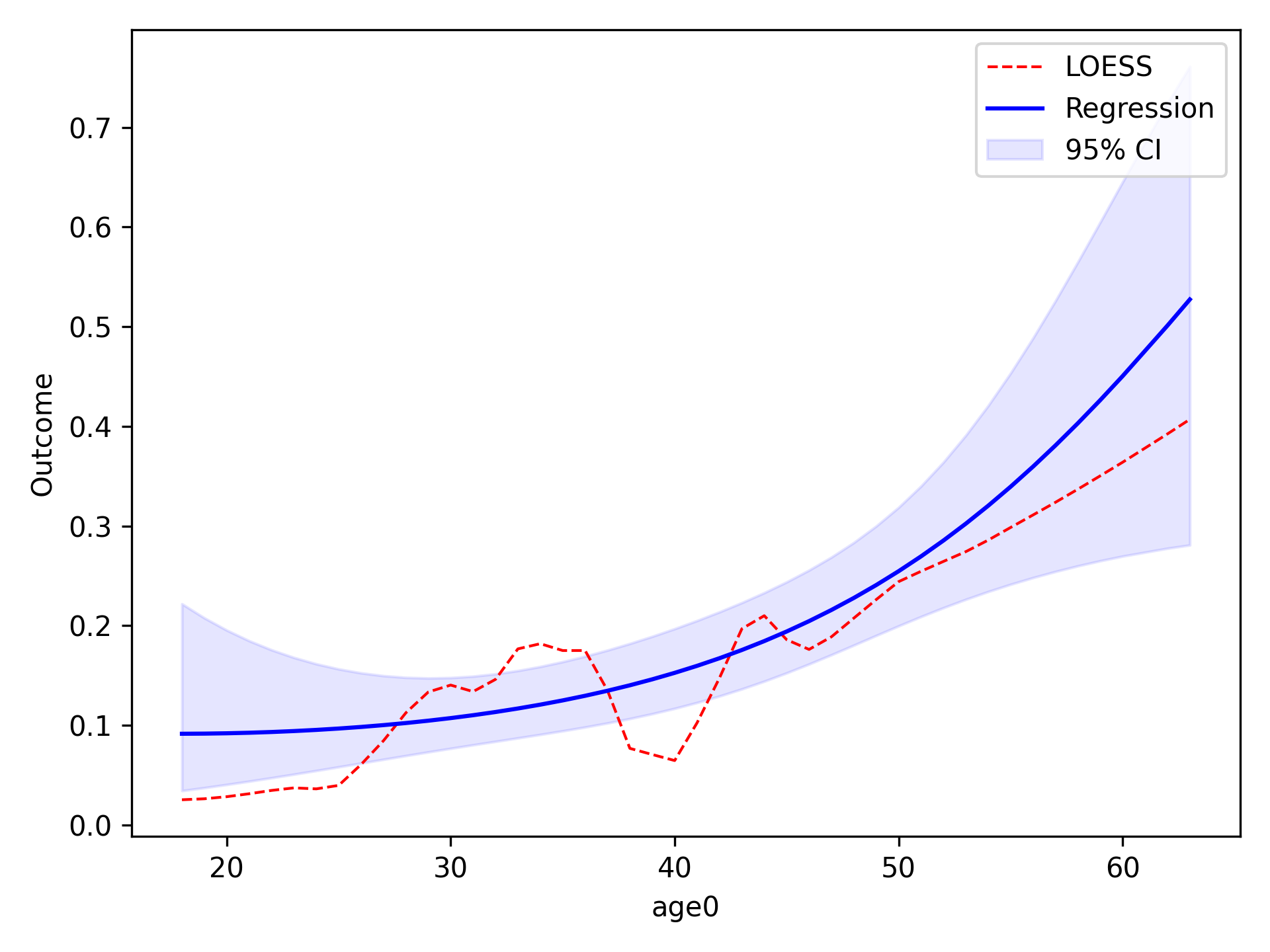
Quadratic
To implement other functional forms besides linear terms, the optional f_form argument must be supplied. Note that
any terms specified in the f_form argument must be part of the data set. We can assess a quadratic functional form
like the following
functional_form_plot(df, outcome='dead', var='age0', f_form='age0 + age0_sq', discrete=True)
plt.show()
The f_form argument is used to specify any functional form variables that are coded by the user
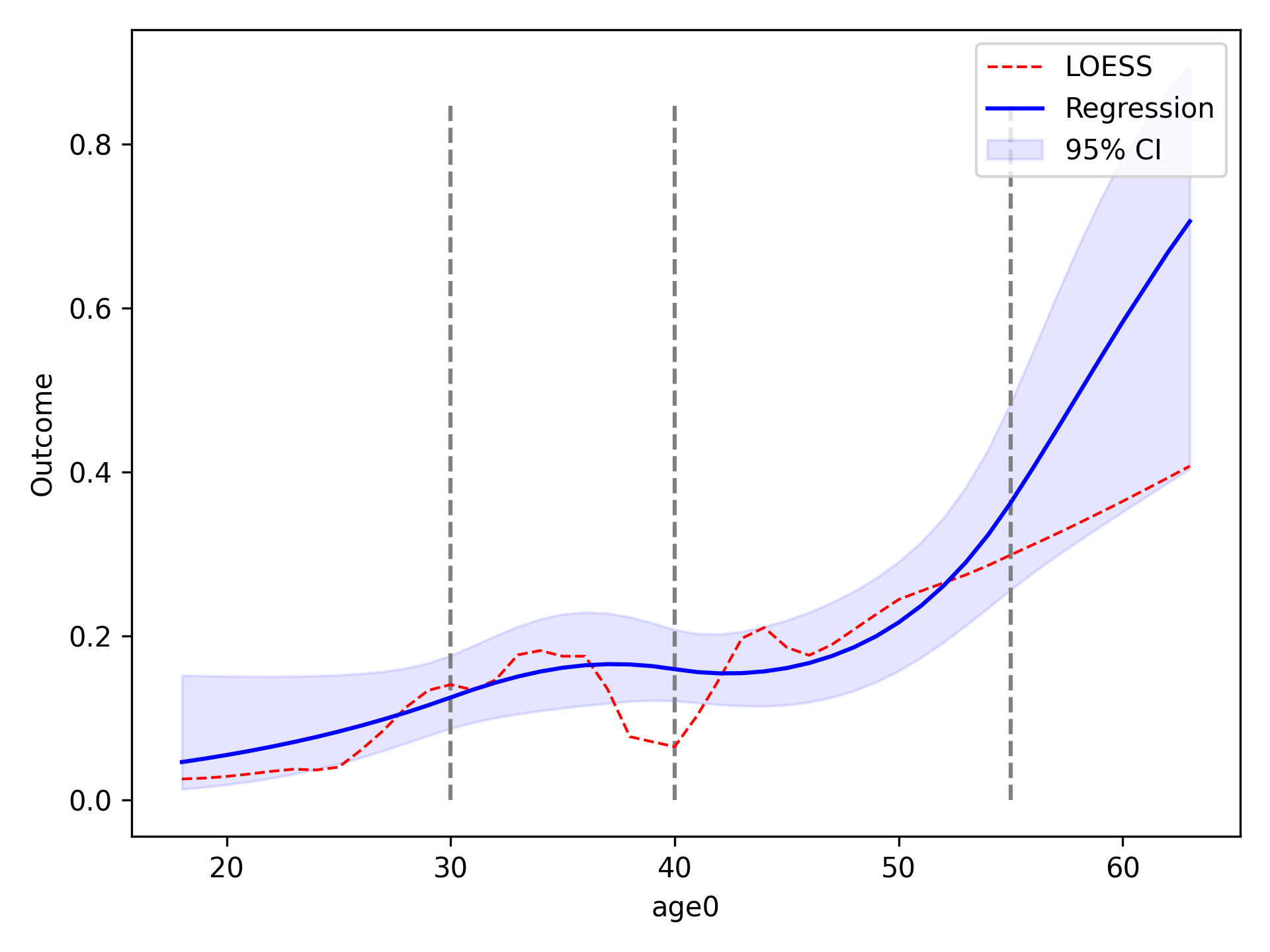
Spline
We will now compare using restricted quadratic splines for the functional form of age. To show how users can further edit the plot, we will add dashed lines to designate where the spline knots are located
functional_form_plot(df, outcome='dead', var='age0', f_form='age0 + rqs0 + rqs1', discrete=True)
plt.vlines(30, 0, 0.85, colors='gray', linestyles='--')
plt.vlines(40, 0, 0.85, colors='gray', linestyles='--')
plt.vlines(55, 0, 0.85, colors='gray', linestyles='--')
plt.show()
Continuous Variables
For non-discrete variables (indicated by discrete=False, the default), data is binned into categories
automatically. The number of categories is determined via the maximum value minus the minimum divided by 5.
To adjust the number of categories, the continuous variable can be multiplied by some constant. If more categories are
desired, then the continuous variable can be multiplied by some constant greater than 1. Conversely, if less categories
are desired, then the continuous variable can be multiplied by some constant between 0 and 1. In this example we will
look at cd40 which corresponds to baseline viral load.
functional_form_plot(df, outcome='dead', var='cd40')
plt.show()
If we use the current values, the number of categories is indicated in the console output as
A total of 99 categories were created. If you would like to influence the number of categories
the spline is fit to, do the following
    Increase: multiply by a constant >1
    Decrease: multiply by a constant <1 and >0
We can see that statsmodels has an overflow issue in some exponential. We can decrease the number of categories
within cd40 to see if that fixes this. We will decrease the number of categories by multiplying by 0.25.
df['cd4_red'] = df['cd40']*0.25
functional_form_plot(df, outcome='dead', var='cd4_red')
plt.show()
Now only 24 categories are created and it removes the overflow issue.
P-value Plot
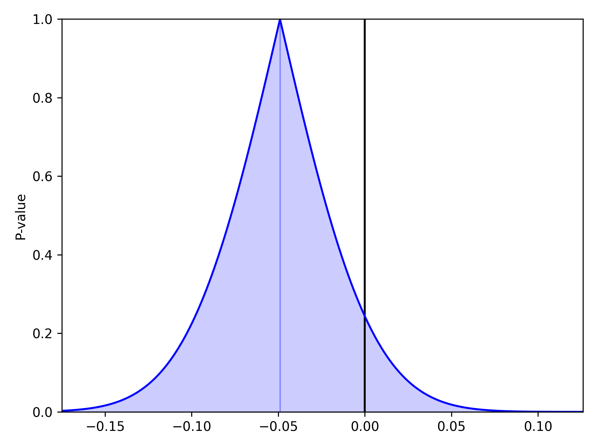
As described and shown in Epidemiology 2nd Edition by K. Rothman, this function is meant to plot the p-value distribution for a variable. From this distribution, p-values and confidence intervals can be visualized to compare or contrast results. Note that this functionality only works for linear variables (i.e. Risk Difference and log(Risk Ratio)). Returning to our results from the Measures section, we will look at plots of the Risk Difference. For a risk difference of -0.049 (SE: 0.042), the plot is
from zepid.graphics import pvalue_plot

pvalue_plot(point=-0.049, sd=0.042)
plt.show()
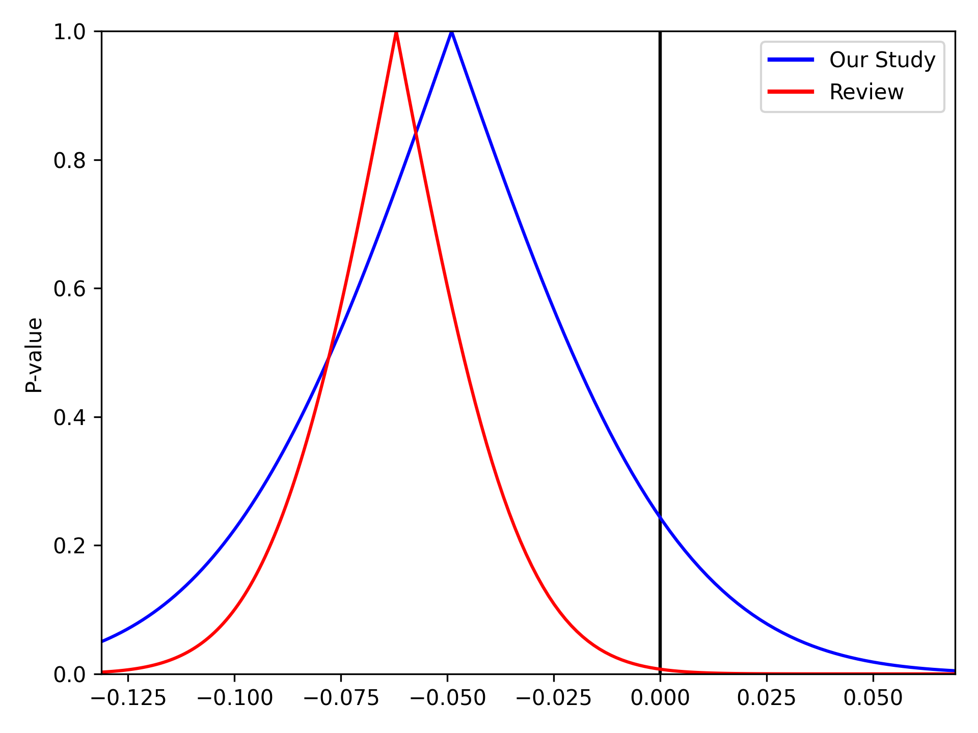
We can stack multiple p-value plots together. Imagine a systematic review was conducted prior to our study and resulted in a summary risk difference of -0.062 (SE: 0.0231). We can use the p-value plots to visually display the results of our data and the systematic review
from matplotlib.lines import Line2D

pvalue_plot(point=-0.049, sd=0.042, color='b', fill=False)
pvalue_plot(point=-0.062, sd=0.0231, color='r', fill=False)
plt.legend([Line2D([0], [0], color='b', lw=2),
            Line2D([0], [0], color='r', lw=2)],
           ['Our Study', 'Review'])
plt.show()
Spaghetti Plot
Spaghetti plots are a fun (sometimes useful) way to look for outliers/patterns in longitudinal data. The following is an example spaghetti plot using the longitudinal data from zEpid and looking at CD4 T cell count over time.
df = ze.load_sample_data(timevary=True)
ze.graphics.spaghetti_plot(df,idvar='id',variable='cd4',time='enter')
plt.show()
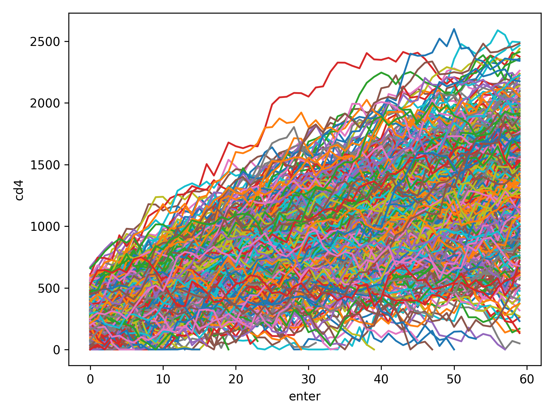
NOTE If your data set is particularly large, a spaghetti plot may take a long time to generate and may not be useful as a visualization. They are generally easiest to observe with a smaller number of participants. However, they can be useful for finding extreme outliers in large data sets.
Effect Measure Plots
Effect measure plots are also referred to as forest plots. Forest plots generally summarize the of various studies and collapse the studies into a single summary measure. Effect measure plots are similar but do not use the same summary measure. For an example, I am going to replicate Figure 2 from my 2017 paper “Influenza vaccination status and outcomes among influenza-associated hospitalizations in Columbus, Ohio (2012-2015)” published in Epidemiology and Infection
The first step to creating the effect measure plot is to create lists containing; labels, point estimates, lower confidence limits, and upper confidence limits
import numpy as np
from zepid.graphics import EffectMeasurePlot

labs = ['Overall', 'Adjusted', '',
        '2012-2013', 'Adjusted', '',
        '2013-2014', 'Adjusted', '',
        '2014-2015', 'Adjusted']
measure = [np.nan, 0.94, np.nan, np.nan, 1.22, np.nan, np.nan, 0.59, np.nan, np.nan, 1.09]
lower = [np.nan, 0.77, np.nan, np.nan, '0.80', np.nan, np.nan, '0.40', np.nan, np.nan, 0.83]
upper = [np.nan, 1.15, np.nan, np.nan, 1.84, np.nan, np.nan, 0.85, np.nan, np.nan, 1.44]
Some general notes about the above code: (1) for blank y-axis labels, a blank string is indicated, (2) for blank
measure/confidence intervals, np.nan is specified, (3) for floats ending with a zero, they must be input as
characters. If floats that end in 0 (such as 0.80) are put into a list as a string and not a float, the
floating 0 will be truncated from the table. Now that our data is all prepared, we can now generate our plot
p = EffectMeasurePlot(label=labs, effect_measure=measure, lcl=lower, ucl=upper)
p.labels(scale='log')
p.plot(figsize=(6.5, 3), t_adjuster=0.02, max_value=2, min_value=0.38)
plt.tight_layout()
plt.show()
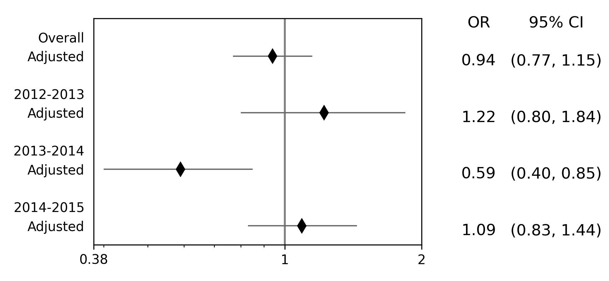
There are other optional arguments to adjust the plot (colors of points/point shape/etc.). Take a look through the Reference page for available options
NOTE There is one part of the effect measure plot that is not particularly pretty. In the plot() function there
is an optional argument t_adjuster. This argument changes the alignment of the table so that the table aligns
properly with the plot values. I have NOT figured out a way to do this automatically. Currently, t_adjuster must
be changed by the user manually to find a good table alignment. I recommend using changes of 0.01 in
t_adjuster until a good alignment is found. Additionally, sometimes the plot will be squished. To fix this, the
plot size can be changed by the figsize argument
Receiver-Operator Curves
Receiver-Operator Curves (ROC) are a fundamental tool for diagnosing the sensitivity and specificity of a test over a
variety of thresholds. ROC curves can be generated for predicted probabilities from a model or different diagnostics
thresholds (ex. ALT levels to predict infections). In this example, we will predict the probability of death among the
sample data set. First, we will need to get some predicted probabilities. We will use statsmodels to build a simple
predictive model and obtain predicted probabilities.
import matplotlib.pyplot as plt
import statsmodels.api as sm
import statsmodels.formula.api as smf
from statsmodels.genmod.families import family,links
from zepid.graphics import roc

df = ze.load_sample_data(timevary=False)
f = sm.families.family.Binomial(sm.families.links.logit)
df['age0_sq'] = df['age0']**2
df['cd40sq'] = df['cd40']**2
model = 'dead ~ art + age0 + age0_sq + cd40 + cd40sq + dvl0 + male'
m = smf.glm(model, df, family=f).fit()
df['predicted'] = m.predict(df)
Now with predicted probabilities, we can generate a ROC plot
roc(df.dropna(), true='dead', threshold='predicted')
plt.tight_layout()
plt.title('Receiver-Operator Curve')
plt.show()
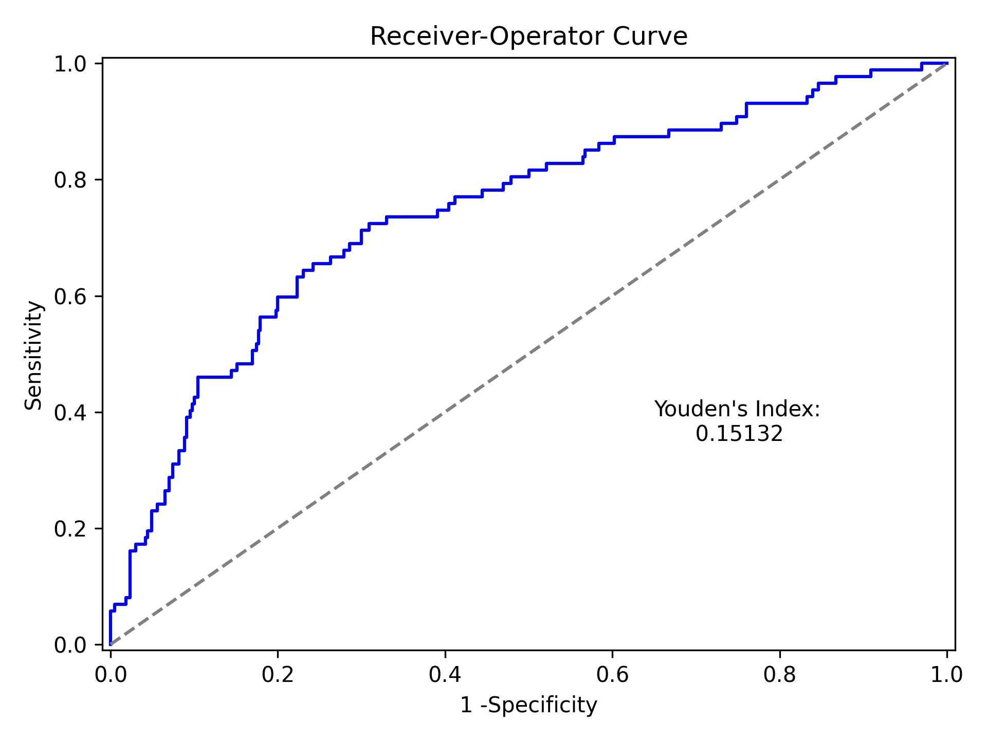
Which generates the following plot. For this plot the Youden’s Index is also calculated by default. The following output is printed to the console
----------------------------------------------------------------------
Youden's Index:  0.15328818469754796
Predictive values at Youden's Index
   Sensitivity:  0.6739130434782609
       Specificity:  0.6857142857142857
----------------------------------------------------------------------
Youden’s index is the solution to the following
where Youden’s index is the value that maximizes the above. Basically, it maximizes both sensitivity and specificity. You can learn more from HERE
Dynamic Risk Plots
Dynamic risk plots allow the visualization of how the risk difference/ratio changes over time. For a published example, see HERE and discussed further HERE
For this example, we will borrow our results from our IPTW marginal structural model. We will use the fitted survival
functions to obtain the risk estimates for our exposed and unexposed groups. These were generated from the
lifelines Kaplan Meier curves (estimated via KaplanMeierFitter).
a = 1 - kme.survival_function_
b = 1 - kmu.survival_function_
dynamic_risk_plot(a, b)
plt.show()
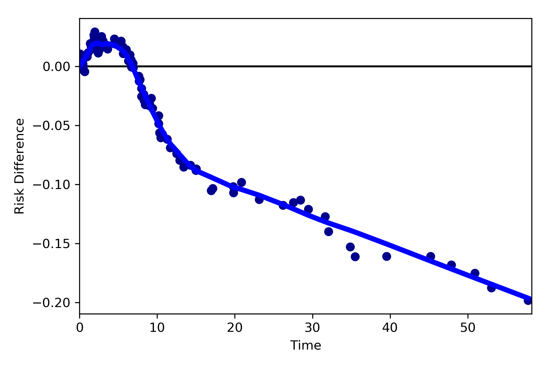
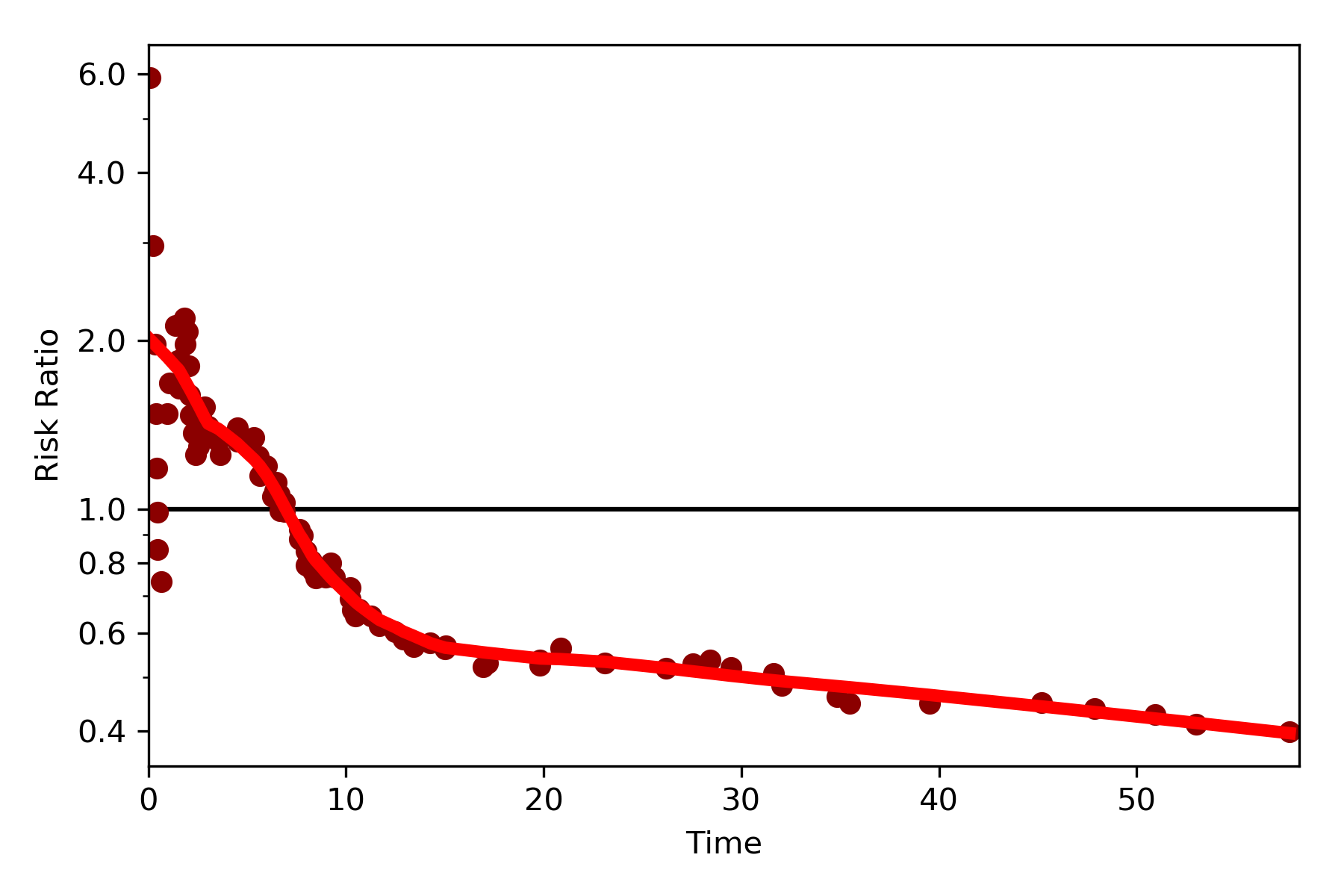
By default, the function returns the risk difference plot. You can also request a risk ratio plot (and with different colors).
dynamic_risk_plot(a, b, measure='RR', point_color='darkred', line_color='r', scale='log')
plt.yticks([0.4, 0.6, 0.8, 1, 2, 4, 6])
plt.show()
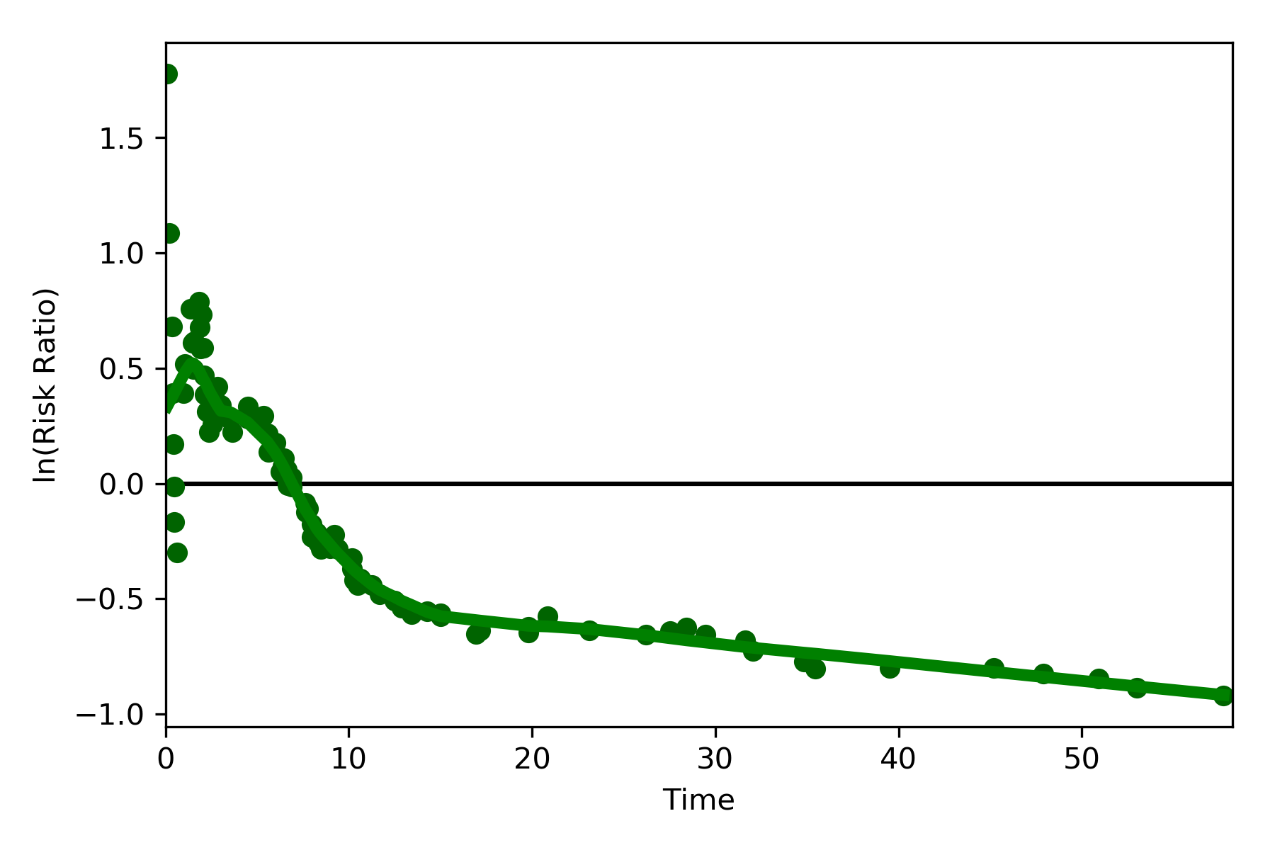
The log-transformed risk ratio is also available
dynamic_risk_plot(a, b, measure='RR', point_color='darkgreen', line_color='g', scale='log-transform')
plt.show()
L’Abbe Plots
L’Abbe plots have generally been use to display meta-analysis results. However, I also find them to be a useful tool to explain effect/association measure modification on the additive or the multiplicative scales. Furthermore, it visually demonstrates that when there is a non-null average causal effect, then there must be modification on at least one scale.
To generate a L’Abbe plot, you can use the labbe_plot() function. Below is example code to generate an empty L’Abbe
plot.
from zepid.graphics import labbe_plot

labbe_plot()
plt.show()
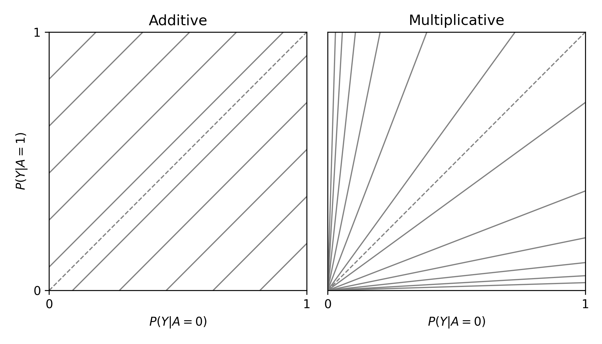
In this plot, you are presented lines that indicate where stratified measures would need to lie on for there to be no additive / multiplicative interaction. By default, both the additive and multiplicative plots are presented. Let’s look at an example with some data
from zepid.graphics import labbe_plot

labbe_plot(r1=[0.3, 0.5], r0=[0.2, 0.7], color='red')
plt.show()
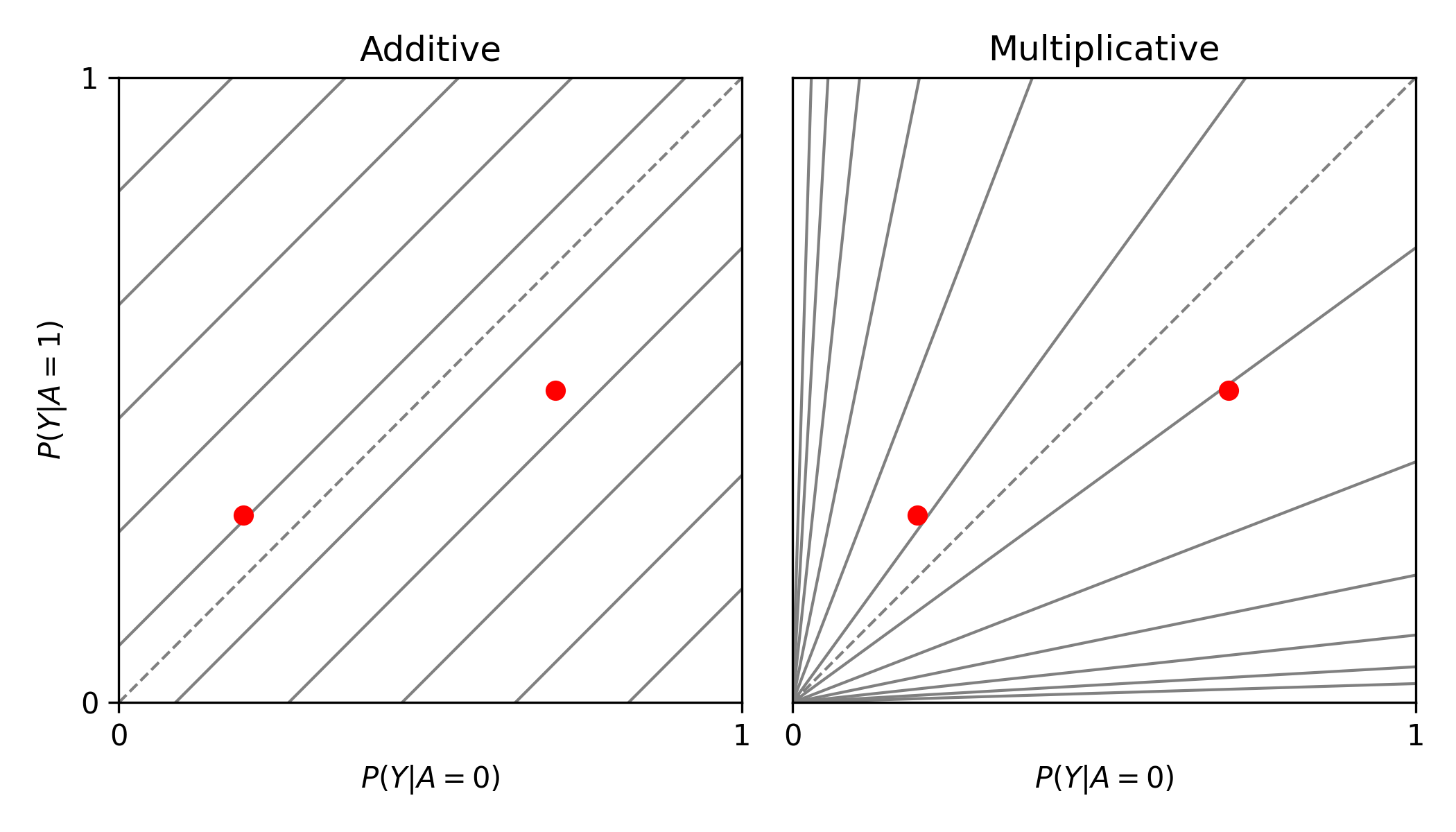
As seen in the plot, there is both additive and multiplicative interaction. As would be described by Hernan, Robins, and others, there is qualitative modification (estimates are on opposite sides of the null, the dashed-line). Let’s look at one more example,
from zepid.graphics import labbe_plot

labbe_plot(r1=[0.25, 0.5], r0=[0.1, 0.2], color='red')
plt.show()
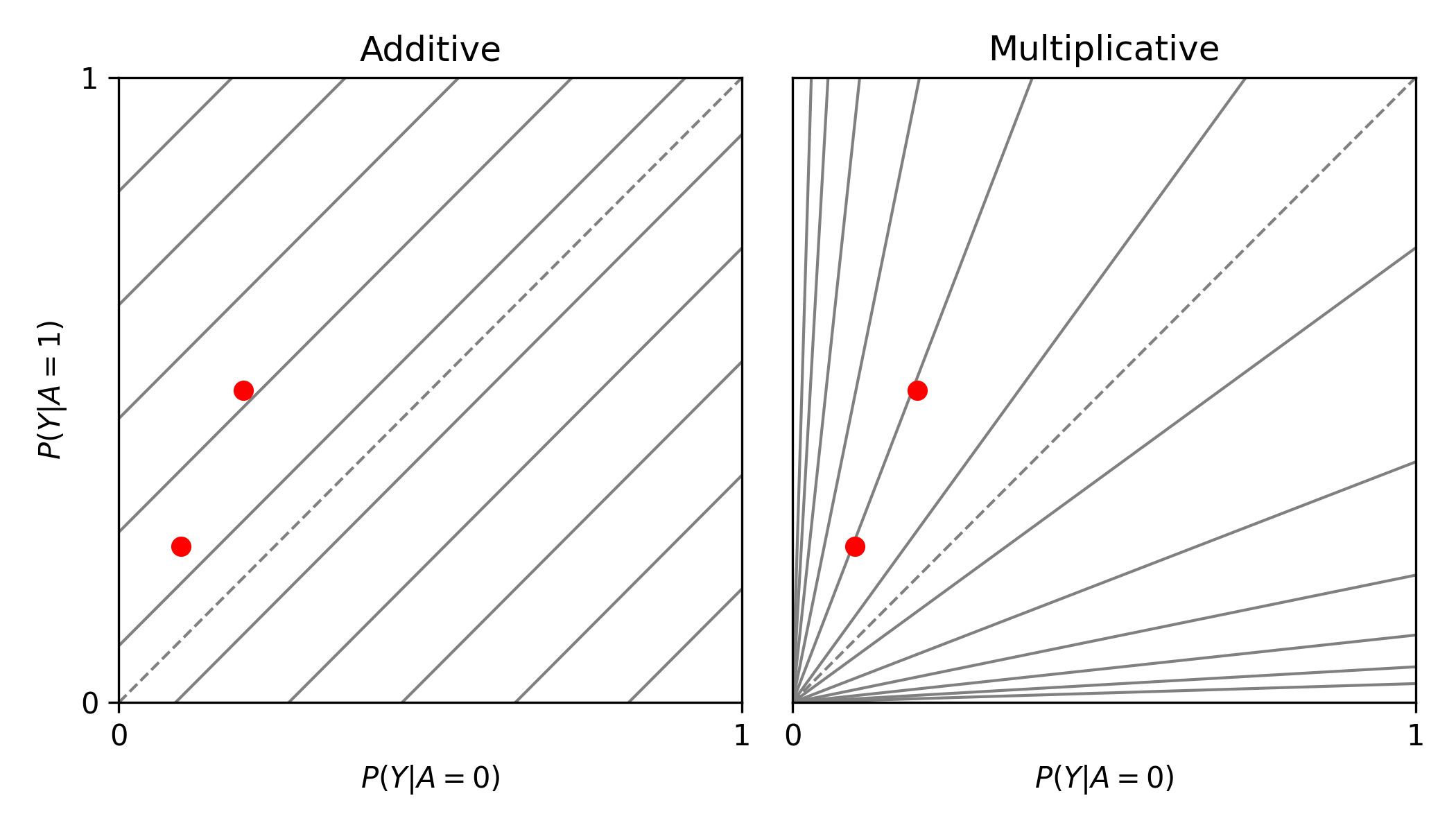
In this example, there is additive modification, but no multiplicative modification. These plots also can have the number of reference lines displayed changed, and support the keyword arguments of plt.plot() function. See the function documentation for further details.
Zipper Plot
Zipper plots provide an easy way to visualize the performance of confidence intervals in simulations. Confidence intervals across simulations are displayed in a single plot, with the option to color the confidence limits by whether they include the true value. Below is an example of a zipper plot. For ease, I generated the confidence intervals using some random numbers (you would pull the confidence intervals from the estimators in practice).
from zepid.graphics import zipper_plot
lower = np.random.uniform(-0.1, 0.1, size=100)
upper = lower + np.random.uniform(0.1, 0.2, size=100)

zipper_plot(truth=0,
            lcl=lower,
            ucl=upper,
            colors=('blue', 'green'))
plt.show()
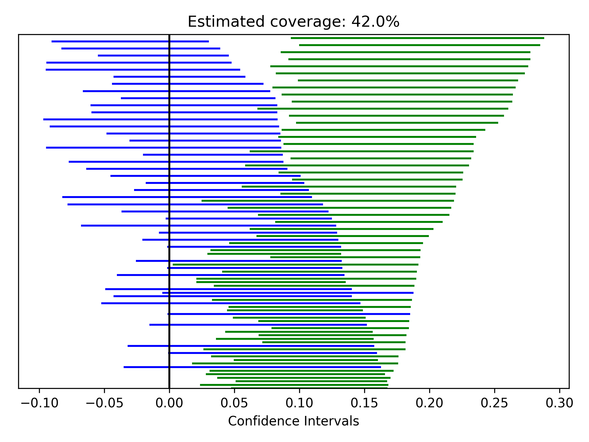
In this example, confidence interval coverage would be considered rather poor (if we are expecting the usual 95% coverage).